Back in the day, when I was starting with graphic design, I learned something important…
I worked on a flyer that turned out to be a big pile of mess.
What I had on my canvas could easily be described as bird vomit.
I had…
Three different fonts…
Color palettes that didn’t go well together…
My layout was all over the place.
I used way too many graphics.
And as I kept adding different graphics to it, it became unclear what the whole message was all about.
Just as I said…
…A PILE OF MESS!
I left it alone for a few days and started searching online for what I was doing wrong.
I stumbled upon a video that explained one very important thing I had missed.
It hit me like a sledgehammer over the head…
I GOTTA MAKE IT SIMPLE!
This is when I realized that less is more.
And it completely changed the way I design today, where my focus is and how important it is to have one clear message throughout the whole design.
Because here’s the thing…
Cluttered design will distract your viewer, follower, or potential customer…
Have too much on your canvas and they won’t understand what you’re trying to say…
More than two calls to action result in no action taken almost every time.
And so…. have a clear vision, know what the message is… and make sure it’s clear and easy to understand.
Hope this helps…
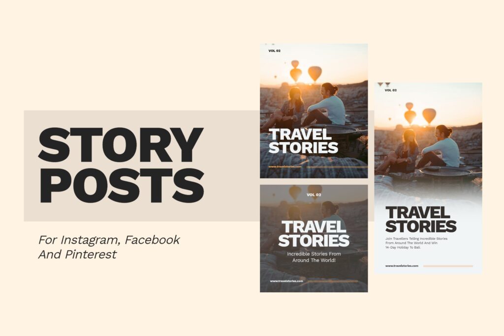
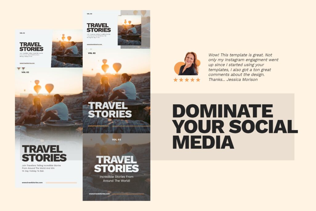
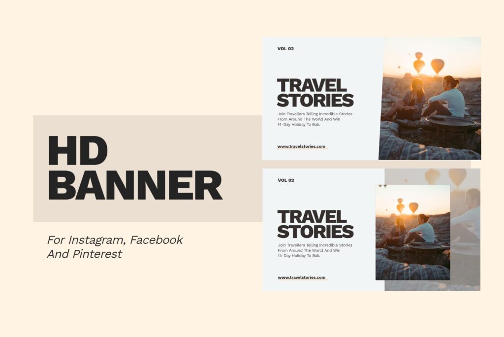
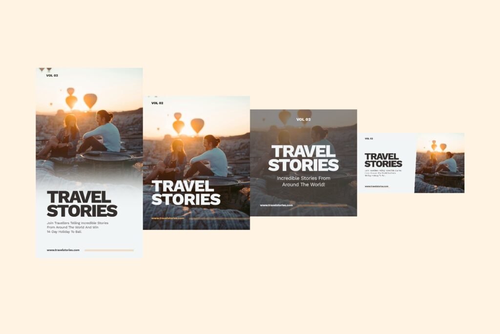
If you’re interested in this Glorify template and would like to grab it, you can do so by going to the link below.
https://designwithglorify.com/b/travel-stories


