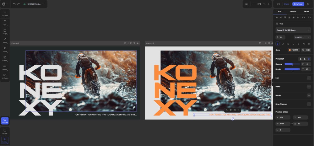
Yesterday, I couldn’t have cared less if my projects got done.
Honestly, I was in one of those moods where I just wanted to drop everything, head into the woods, and disappear.
Then something grabbed my attention.
I saw a post from Nicola Vargiu announcing an update…a slick new feature that not only looks great but also makes Glorify even easier to work with.
I had to check it out.
Next thing I know, I’m back at my desk, testing it out.
And guess what?
Within minutes, I had cranked out a new design.


Not too bad… considering it literally took me less than three minutes.
Anyway…
So, what’s the new feature that makes Glorify even easier to work with?
The new sliders, which promise easier workflow and an overall better experience.
I played around with them, and to be honest, it’s nothing to go crazy about.
It won’t improve your design skills or turn you into a pro designer.
No…
What it does is… look slick.
And so, if you care about fancy, aesthetically pleasing UI, then this is for you.
For me, though, I couldn’t care less.
Anyway…
If you want to see it in action, you can try Glorify free for 7 days.
Give it a shot.
If you like it, subscribe.
If not, there are plenty of other tools out there for your social media posts, ads, flyers, or whatever else you need a design tool for.
Catch you tomorrow…
