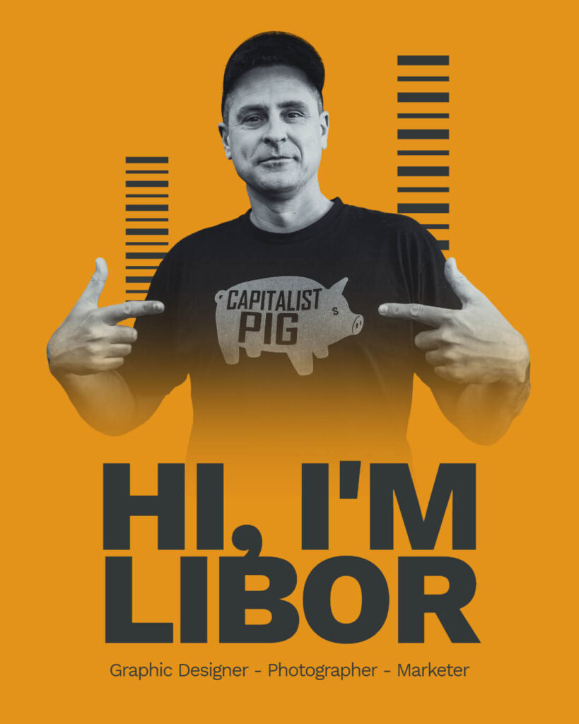
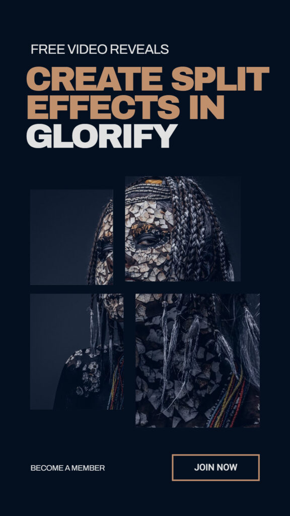
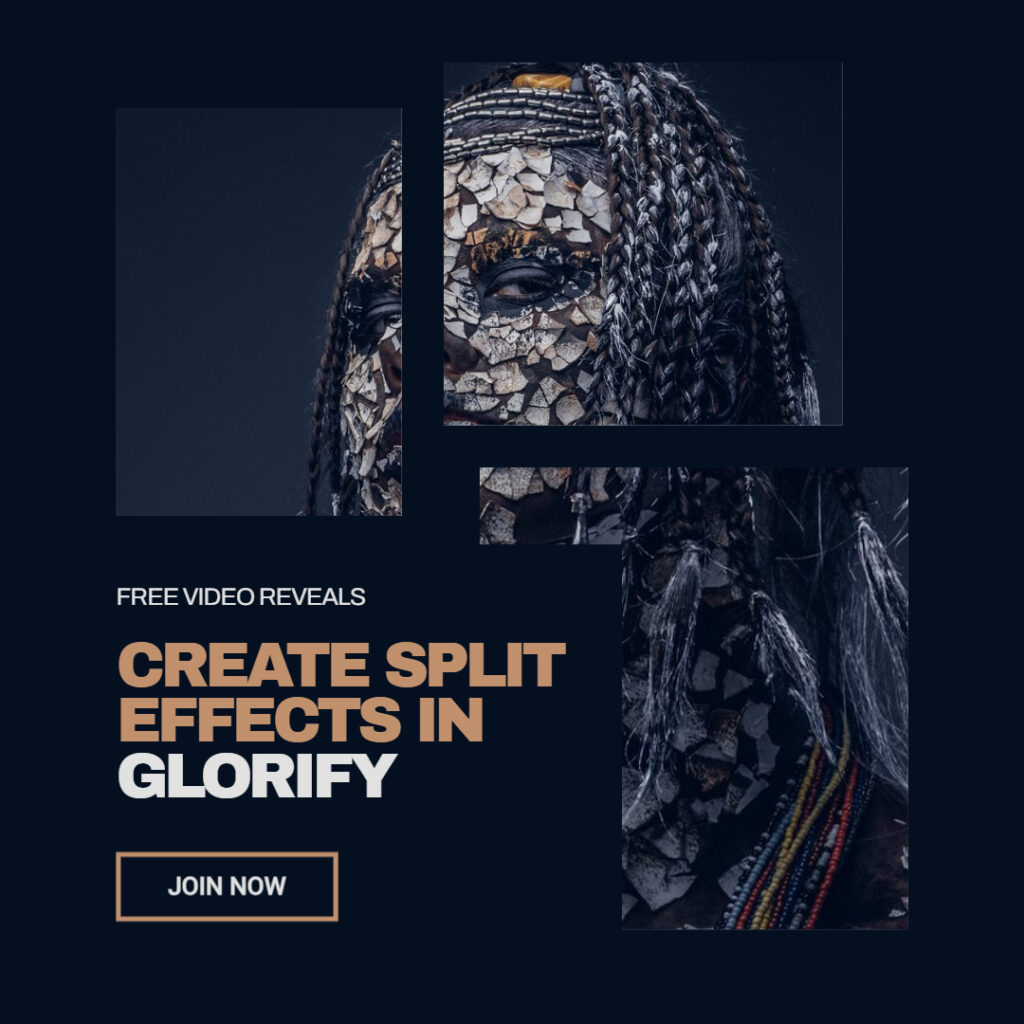
Right after I showed you how easy it is to take any of the Glorify templates from the library and make quick changes to it…
I got this message…
“Great but I’m not good at this”
…to which I replied, of course not… especially not when before you even commit to a project, you start telling yourself that you’re not good at something.
By the way, I’ve done that in the past myself.
It’s natural but hang on it too long, and you’re limiting yourself from who you can become.
So many of my ideas went to trash just because I talked myself out of it…
My thoughts took over and I’ve never even started the project.
And so… the best thing you can do is to…
- Design with low expectations.
If it’s not gonna work and you have to scrap the idea and start the project again…
…well, so be it!
No one’s gonna cut your hands off for screwing up…
- Play like you were a kid.
Kids like to play. They’re in their world and couldn’t care less about what you think about them screwing something up… and I’m telling you, if you want your project to spark with confidence, attract your customers, and have this irresistible feel to it whenever you look at it, well, you better play like a kid when you design…
Experiment with graphics, elements, layouts, fonts, colors… Don’t be afraid to break the rules to come up with something unique and easily recognized as your style.
- Trigger the Viewer..
…Is my way of thinking about it. Every time I go design a new project, I always think about how I can trigger the person viewing the design/content on the other side.
And so… figure out what they go through in their lives. Who are they in the first place? What are their beliefs? What do they watch in their spare time?
For example…
If you have an audience that watches a specific TV series on Netflix and you know what it is, well, you can get a ton of ideas from that TV series for your next design.
And be almost certain, your followers will respond to it well.
Perhaps even buy whatever you’re selling because you’re talking their language, tapping into their psyche… and so on.
There is so much you can do prior to designing your content, product images, flyers, and more that will increase your chances to gain a new follower or steer the one you have into taking action and buying your products…
From the pre-design, to actual design, to final result, and then the marketing you do afterward.
And as I write these emails, letting you pick my brain, hopefully you’ll learn tips and tricks on how to go about designing killer ads, content or whatever you’re working on.
If you want more details, you can join my email list… where I also share my Glorify templates and go more in-depth about the projects I design, the psychology behind it and things to avoid.
You can sign up here…
https://liborbednarik.com/design-like-a-pro
–
