One of my favorite things to do when I’m designing a flyer for adventure-related content, sports, music events, or whatever, is to use textures.
These textures could be anything from dirt, grunge, grain, paper cuts, noise, dust, gritty-grainy, concrete, gravel, or film textures.
They give the design a completely different look.
For example, take the project I worked on yesterday:
Here is a render without the texture:
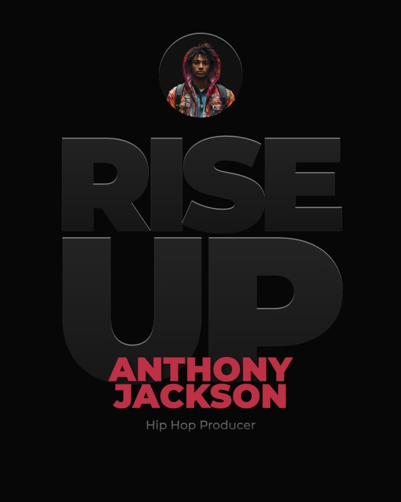
To my eye, the design looks naked.
Now, look at the design with the texture. Actually, two textures stacked on top of each other.
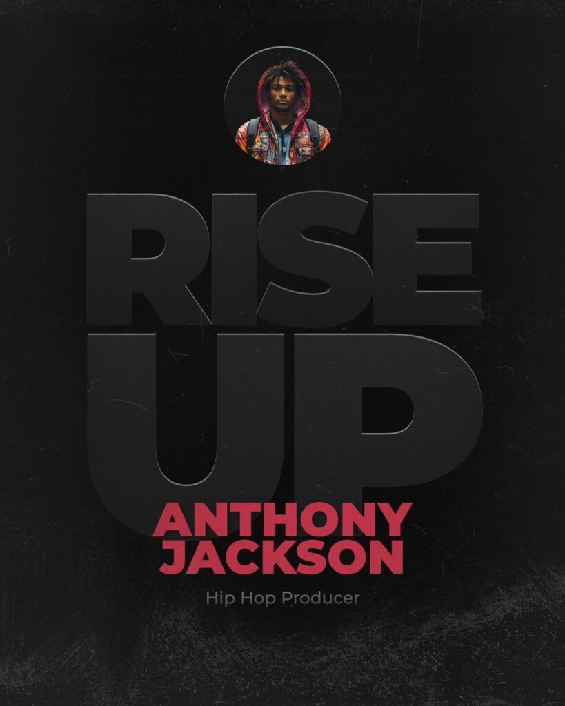
Totally different.
Now it looks more like a movie poster…
Well, it could be one if I added a few key elements.
Whatever…
What I’m suggesting here is that you use textures to add more character to your overall design.
–